Semester Final
What I did this Semester
This semester I completed a variety of projects in my graphic design class. The projects I completed this semester would be 11x17 poster, typography 5x5 artboards, combination marks, business card, letterhead, and envelopes.
11x17 Poster

The first project of the semester is my 11x17 Bauhaus Poster. The project took around two to three weeks. Some challenges I faced while creating this project was I lost all my skills with the software Adobe Illustrator. This project was assigned to the class after retiring from spring break, which caused to to forget a lot of the software. Along the way I learned more about the Bauhaus Movement (a historical movement in the graphic design world that revolutionized the arts today). Some positive feedback I remember getting for this project was nice use of colors, I really like how clean your design is, and how it represents the movement perfectly. Some constructive feedback I got was some of the information on the poster is too small. What I changed on my finished product was the information I made it bigger and organized it a different way to give important information some hierarchy. My overall opinion about the project is it was okay it wasn't really my best work I have created but this project does show one thing. It shoes how much my skills have improved, which is what I would want to see, considering this project was in the beginning of the semester.
 Typography 5x5 Artboards
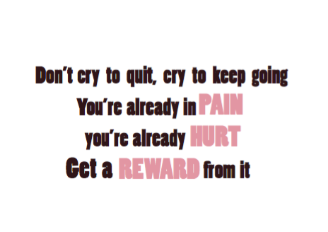


 This is the second project of the semester and it was 5x5 typography artboards. This project took around three to four weeks to complete because we had to start with sketches, then create it on Adobe Illustrator, then make a black and white version, followed by color scheme versions, then lastly we got to create our finished products. To the right I have my finished products which would be my best version of each inspirational quotes I created for the whole process. Some challenges I faced when creating these projects was finding the correct fonts needed for the quote. At first I couldn't really find fonts that worked together, or I just couldn't find fonts that looked good and fit the quote itself, which took me a long time to find fonts that satisfied me. Along the way I learned about color schemes and what colors work best together. This was the first time the class was required to use color schemes, which really helped me in the future as most of my recent projects dealt with color schemes. Some constructive feedback I was given for this project was some of the fonts are hard to read due to the picot backgrounds, the font needs to be aligned better, and lastly one photo was a little stretched. Some postive feedback I received was the quotes really fit you and describe what personality you have, great back story to why you selected the quotes and the photos, and nice color schemes. After receiving my feedback I only changed one thing, which was how my text was aligned on one of the artbaords. My overall opinion on this project was I really enjoyed doing this project because it was one I could make a personal connection on. Furthermore the project was just fun to do and I consider it one of the best projects I've done this year.
 Company Rebrand
 The company rebrand as a whole would include combination mark, business card, letterhead, envelope, and rebrand display. This whole project I would say took around a month to a month and a half because of how many parts were included in each part.
Combination Mark
 The first step to the whole company rebrand was creating combination marks. It all started with sketches of 30 symbols, 15 word marks, and 6 final combination marks. the combination marks alone took around 2 weeks to complete as we first had to do research about the company and design a logo that really fit the company. Some challenges I faced while completing this mini step in a huge project is ideas. After a while I couldn't come up with any ideas about creating more symbols, word marks. after a while they all just started to look the same and had little variety. Along the way I learned nothing really about graphic design other than how hard it is to create an original logo no one has used. For this project there was really no feedback given as the work was not shown to classmates. There was nothing to really change with this project since we got no feed back and it was just sketches. I have no opinion on this project as it was not really important.
Business Card
This project was the second part to our company rebrand. The scope of the project was to create a business card with our company logo. This project took around 25 minutes to create which equivocates to around half a class period. I really didn't face any challenges when completing this project as it was pretty simple to complete and didn't require much work or creativity. When doing this project the only thing I learned was how big a business card was. Some constructive feedback I received for this project was don't use a different combination mark for the front and back as it might confuse the viewer. I received no positive feedback for my business card. I did not change anything on this project as I felt nothing needed to be changed. Overall I really enjoyed this project as it was simple and didn't require much thought or work to be done.
 |
Letterhead
This project was the third/ fourth step in creating or company rebrand. This is the letterhead I created for my company rebrand. This project took me around 25 minutes which again is around half a class period. Again, I faced no challenges when completing this project as it was pretty simple and all I had to do was follow directions. Along the way I learned what a letterhead looks like and how big a letterhead should be. Some constructive feedback I received for this project was remove the second combination mark, and lastly make the information about the company bigger. Some positive feedback I received was I like both the combination marks being there as it adds variety, and I like how you used the second combination mark on the front and how it is faded. I changed nothing on this project as I was satisfied with my work and I don't care what others think. So I did what I thought looked best and what makes me happy. My overall opinion of the project is this was easy to complete.
Envelope

The envelope is located flesh right in the bottom corner. This project was to create a envelope both front and back for my company rebrand. This project took me around 5-10 minutes to complete. Some challenges I faced when completing this project was I did not know what a enveloped look like which cause me to have to redo my whole project. Along the way I learned what an envelope should look like and the correct dimensions of one. Some positive feedback I received is nice accent color used on the flap. Some constructive feedback I received was make the information about the company bigger. When I received this feedback I did end up changing the information size so it would become legible. Overall, I really like the whole company rebrand project as it was fun, and allowed creativity as we had little guide lines.
How I Used My Class Time
I have used my class time really efficiently. When I was in class I got to work and didn't mess around at all as I wanted to finish my projects as fast as possible. In the times that I finished early/ thought I was done I stayed on task by collaborating with students about their projects and helping them along the way and building strong relationships by doing so. When Mrs. Smith my (Boss) assigned me an eight hour project and when it only took me seven to enhance my projects by asking students for feedback and if they had good feedback that I agreed with I would change the issue, which in return made my projects better. What I did outside of class to enhance my graphic design skills was one doodle on my netbooks when I was suppose to be focusing on other subjects or working on homework. Furthermore, I enhanced my graphic design skills by creating personal logos and doing other work that increased my tech logical skills in graphic design. In terms of what I did outside of class to enhance my work is I did absolutely nothing. I could have came in to improve stuff but i didn't because I had more important stuff to do outside of class.
Strengths as a Graphic Designer
I do not have any strengths as a graphic designer as I'm pretty weak in this area of eComm. But one strength I do have is I turn in my work in on time. This is a good skill not only for eComm but for the rest of life as an employer does not want a lazy worker.
Areas of Improvement
EVERYTHING. I suck at graphic design, which is why I'm quitting it.
Summary
What I loved most about this semester is the classmates I had. I came into this class thinking I was going to hate every second of this class for the whole year, but it quickly became my favorite because of the loving environment Mrs.Smith created. What I would change about this semester is adding more detail to my projects as most of them were pretty plain. What I am going to learn from this semester and school year is I am not gifted in graphic design and in my future career of eComm I need to focus on SID. One goal I want to set for next school has nothing to really do with this class but is to get a unweighted GPA of 4.0 and a weighted GPA of 4.4. Final thoughts is I really loved this class because of everyone in the class they really made my school year better.


